ARC Browser
I recently had the chance to try out the ARC Browser from Browser Company, a web browser that claims to reimagine the way we browse the web. I wanted to share my thoughts with you about this new browser.
Installation
The installation process was straightforward, but it is currently only available for MacOS users. The browser offers a slightly different approach to login and customization, making it feel like a warm welcome to a new browser.
 Here you can see a short GIF animation of the onboarding settings of colour and transparency in ARC Browser.
Browser Interface
The browser interface looks similar to other major browsers, with the exception of tabs being in the side panel. This feature may already be familiar to some of you from other browsers like Microsoft Edge. However, the thick border around the website window creates a sense of disconnection from the website, which may take some getting used to.
Another feature that takes some getting used to is the small size of the address bar on the side panel, that I often look for when I want to move to a new page. However, ARC Browser offers a range of shortcuts. Once you learn the most important ones as is the command palette [cmd + t], you can easily hide the sidebar and enjoy the web in full. Because everything you need to navigate in this browser is just one key away.
 Command palette contains all your opened tabs, but you can also use it to open new ones or to search in history.
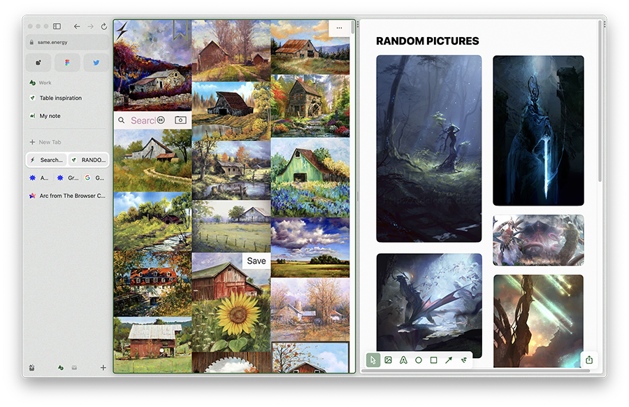
One of the most interesting features of the ARC Browser is the ability to create your own dashboards (easels they call them). With this feature, you can save pictures you like and sort them by different categories as for example recipes, furniture, designs and so on. The browser backlinks images to their original source, making it easy to return to the page where you found the image. This can be incredibly useful for students and creatives who are always looking for new sources of inspiration.
 Images on the same.energy website displayed with my custom easel with fantasy pictures.
Another great feature of ARC Browser is the option to split windows. This feature is a time saver when working with various medieval manuscripts and a dictionary at the same time. Yep, my medievalist speaking. It is also useful when developing, allowing you to easily open website administration or APIs while still seeing the website you are developing. You can split the screen in two ways - side by side and top-bottom.
ARC Browser also offers spaces where you can have different tabs open for different uses. For example, one workspace for work, another for school, and a third for random browsing. Switching these workspaces is easy: you just move to the sidebar and swipe with your fingers on a touchpad or press the icon at the bottom of the sidebar. This feature can be especially useful for those who have a lot of work to do and need to keep different tabs open for different projects.
You can also create notes in the browser with basic formatting options, such as headings, bold, italic, underline, strikethrough, links, and images. However, if you use advanced note-taking apps like Notion or Obsidian, ARC Browser may not replace them. It is still a useful feature for basic note taking and can be a great way to keep track of your ideas.
 Screenshot of the note taking part with draft of this article.
One of the most interesting features of ARC Browser is the "boosts", which are little snippets of code to overwrite website functions or design if you know a little CSS and JavaScript. Some boosts run when the page loads, while others can do more time-consuming tasks and run across tabs. This feature can be incredibly useful for those who have some coding knowledge and want to customize their browsing experience.
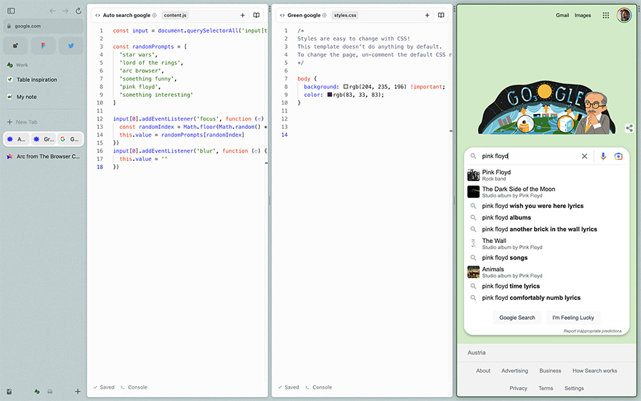 An experiment with boosts - change Google's homepage to green and suggest random term when search input is focused (not really useful, I know).
What I found difficult to use are the extensions, which are hidden behind three vertical dots on the right side of the browser. Some extensions can be summoned via the [cmd + t] shortcut, but I think there should be a more accessible way to show them. For example, if you use a password manager, you need to access that extension quite often, but pressing [cmd + t] and typing its name can be quite time-consuming, and aiming for the three dots on the side is not much better.
ARC Browser is based on Chromium, so most of the settings pages resemble Chrome. However, the developer console is disappointing as it is exactly the same as in Chrome. After discovering boosts and window splitting, I was hoping the developers would make it more similar to these features. Perhaps this will be addressed in the future.
Overall Impression
In my opinion, the ARC Browser is a great alternative to mainstream browsers like Chrome or Firefox. It has a lot of unique features that can make your browsing experience more enjoyable and efficient. The ability to create your own dashboards, split windows, and use boosts are just a few examples of how ARC Browser can improve your browsing experience.
Will it replace my default browser, you ask? Probably not, but it's a great browser to have in your arsenal. If you're used to Chrome, Firefox, or Safari, you may find ARC Browser a bit cluttered, but if you're used to browsers like Vivaldi or Brave, ARC Browser may feel like home.